Snell Tree Experts Website Design Adobe XD, Adobe Illustrator, Procreate
The client, Snell Tree Experts, reached out for a new website layout. They wanted to have a website that no longer felt outdated.
Process
The process began with a discussion on what the client felt was lacking with their current website. The biggest complaint was how outdated the overall look of the website was. After asking what aspects brought on the feeling of being outdated, this list was created:
- The color scheme of green and yellow was great, but the tones that were chosen felt too bright.
- Giving a section for downloading an application to apply for a job was no longer desired.
- The YouTube video at the beginning of the website was from many years ago and is not of the best quality.
With the information of what was not favorable, the discussion of necessities/desires then began. The client wanted sections that talked about the owner, services provided, contact information, and testimonials. The company also has awards/certifications that they wanted to be on display. During this, the client then provided two reference websites to demonstrate the layouts they preferred.
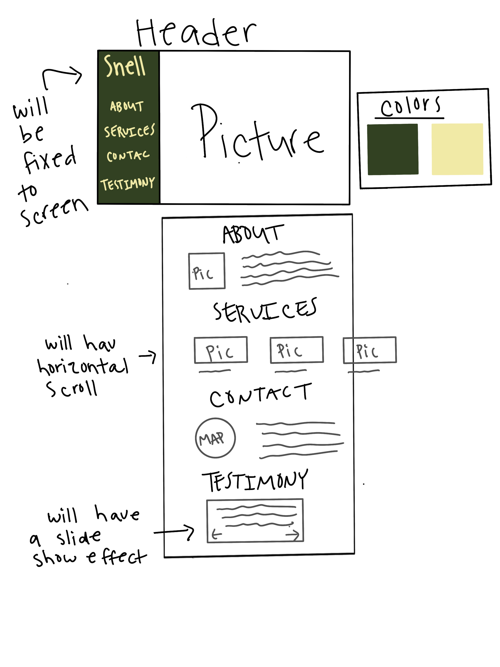
After the discussion and looking at the reference sites, I began with the layout for viewing on a computer. I pulled all the information and photos that were still going to be on the site and saved them for later. Using Procreate, I did a rough sketch of the layout to visualize header, titles, photos, and writing. The client had mentioned that they wanted to add in more services, so we agreed on doing a horizontal scroll in that area to keep the visualize clean. I also picked out new shades of green and yellow to use throughout the site. Once that was completed, I sent the rough sketch over to the person I had been working with to get their approval and when that happened, I started in Adobe XD.
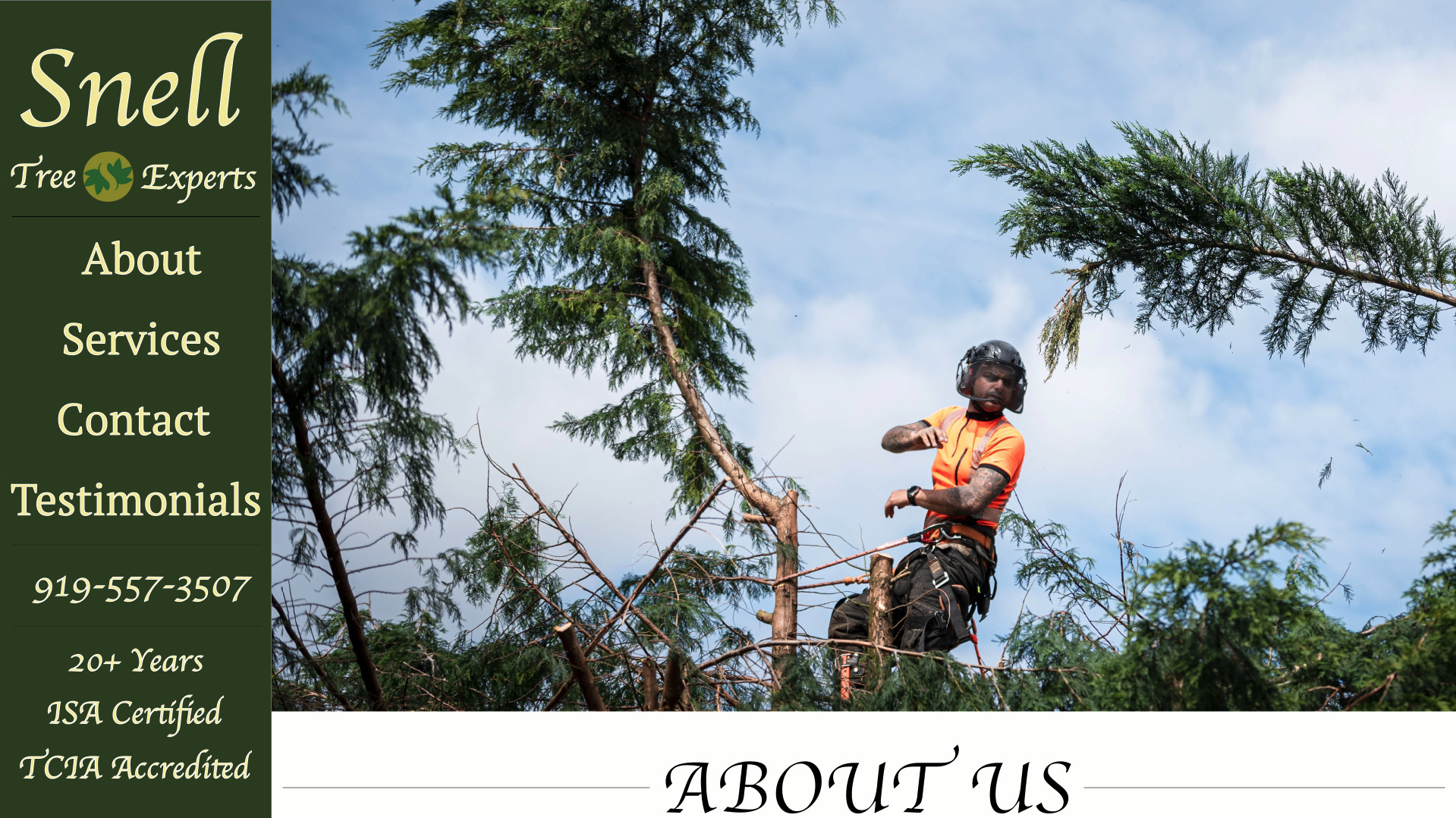
Because the client had mentioned that the thing that drew them to one of the reference sites was the intro photo with a side bar, I made sure to add that into the design. I then proceeded to create the sections but waited to add the scroll feature as well as the slide show of testimonies. With this draft, we decided to tweak where the placement of the awards/certification listing was as well as the shaping of some of the pictures. After the final approval, I added in the scroll feature and slideshow.
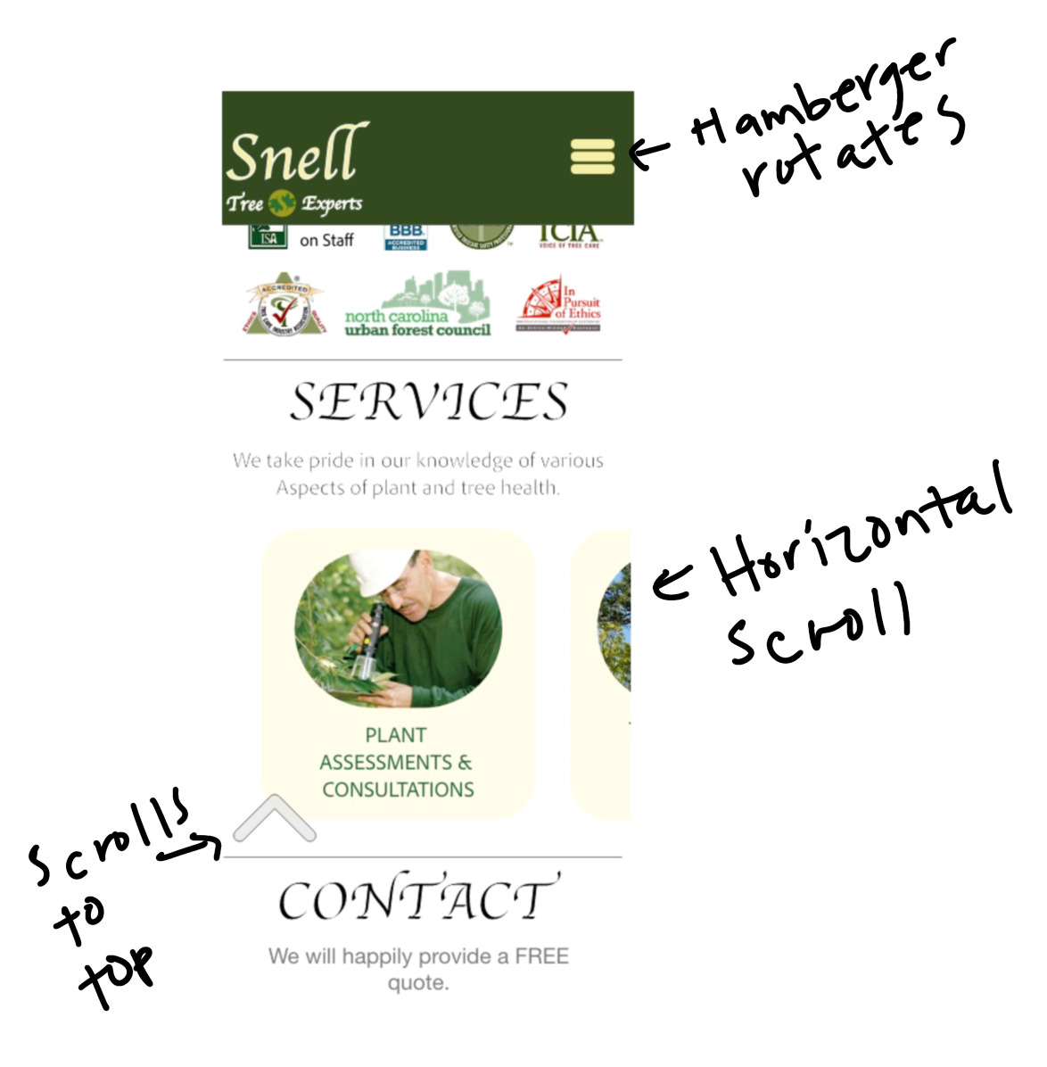
The completion of the website for computer then lead to creating a layout for the phone view. The biggest adjustment made to the mobile view is the header. For mobile, I created a top header with a hamburger navigation bar that rotates when opened. There is also an added feature to scroll the user to the top of the site with an upward button. The placement of a few things does change due to stacking, but information provided is the same as the website so that the viewing experience remains consistent.


Final Product
The final product design can be viewed below:
Takeaway
This project provided a great experience of working with someone to receive feedback as well as build knowledge on gaining information on needs and concerns. I was also able to grow my knowledge on the Abode XD application through creating a slider that takes only a portion of the site. Between the interview process as well as the design experience, I feel this project has provided me with a better ability of understanding the ADDIE model in use for when I enter the field of Instructional Design.
